Branding
Galactive Designs
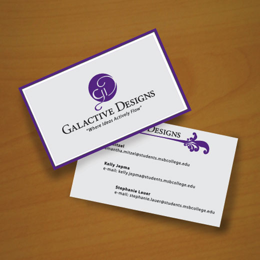
Project: Logo for Galactive Designs, a student design group "where ideas actively flow".
Members: Kelly Jepma, Samantha Mitzel and myself.
- Galactive Designs was chosen as our group name because it incorporated two of our unique qualities.
- First that we were all girls and second that we actively search for good ideas.
- Decided on the overall look and feel of logo together.
- Purple color- because it combines the stability and loyalty of blue with the life and energy of red.
Healthy Living Trail
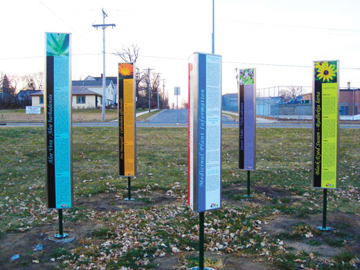
Client: City of Waite Park
Project: A Service Learning Project working with the City of Waite Park to create the branding and signage for the Healthy Living Trail.
- We all came up with designs for main logo.
- My group's (Galactive Designs) design was chosen.
- After a few revisions it became this professional and healthy looking logo.
- I took on the role of Account Executive during this phase of the project and kept in contact with Margie throughout the entire process.
Zanet Game Zone
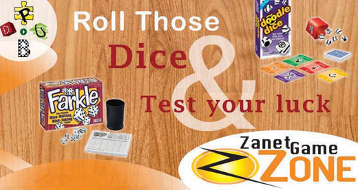
Project: Zanet Game Zone logo
- I created the logo for Zanet Game Zone, a fictional game company that specializes in puzzles, board, dice, and other unique games.
- The logo uses the "Z" for motion and a warm color scheme.
- Together these two components give it the energetic and friendly feel that I was looking for.
Stayin' Alive Music Foundation
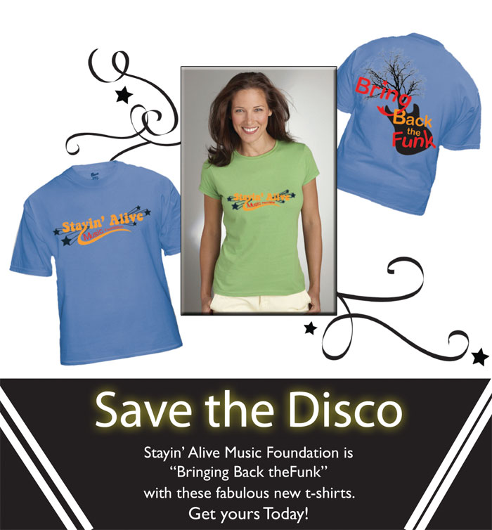
Project: Create a logo for Stayin' Alive Music Foundation, a fictitious non-profit organization, and an advertisement that will be used to sell t-shirts to support their cause.
- Cause: "Save the Disc", a cause which is helping bring back the "funky" music of the past.
- Logo: Friendly and colorful disco theme with music and the 70's and 80's time period in mind.
- Ad: Displays some of the t-shirts that they are selling in a sleek and inviting way.
- Slogan: Pairs the text with a guitar with a tree coming out of it. This symbolizes bringing new life to the funky music of the past.
Metro Salon & Spa
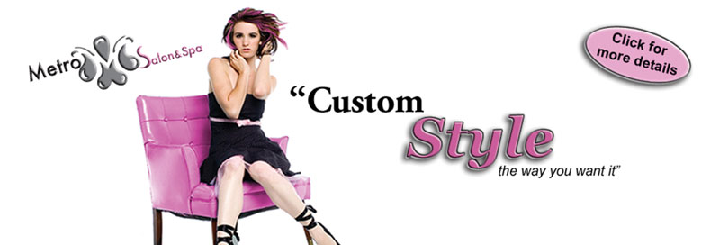
Project: Create a logo and banner ad to help promote Metro Salon & Spa, a fictional company.
- Specifications: Use company colors - pink and shades of grey.
- Make sure the whole company name is in the logo.
- Use the tagline on the banner ad.
- Logo: Metro and relaxing spa feel.
- Water droplets form the letter "M" in the negative space
- Went through all the different steps in the process: thumbnail sketches and illustrated ideas to revisions and final placement.
Peace Lutheran Church
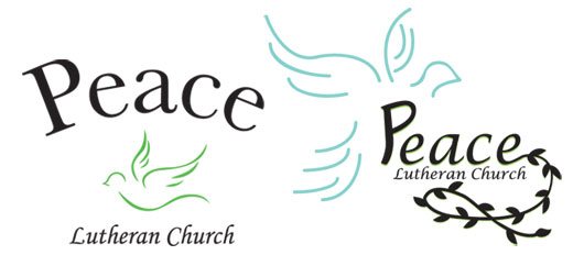
Client: Peace Lutheran Church (Cold Spring, MN)
Project: Create an official logo for the church
- I came up with several different ideas.
- After making revisions I narrowed it down to three main designs.
- They all have a nice peaceful and calming feel to them. The top one with the dove incorporated into the "p" is my favorite.
- (Client decision is still pending.)