Freelance Projects
Healthy Living Trail
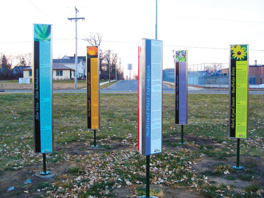
Client: City of Waite Park
Project: A Service Learning Project working with the City of Waite Park to create the branding and signage for the Healthy Living Trail.
- We all came up with designs for main logo.
- My group's (Galactive Designs) design was chosen.
- After a few revisions it became this professional and healthy looking logo.
- I took on the role of Account Executive during this phase of the project and kept in contact with Margie throughout the entire process.
Mascot Alterations
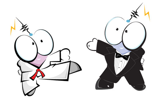
Client: Ameribotics, a non-profit organization established in the Denver, Colorado area to promote whole-person development through robotics.
Project: Take their mascot and the IRO (International Robot Olympiad) mascot and alter them so they will fit better with the theater theme.
- Brought the mascots into Illustrator and illustrated some spiffy tuxedos for them.
- For the IRO mascot I also used Photoshop to alter its appearance.
Robot Olympiad Flyer
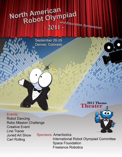
Client: Ameribotics
Project: Design a flyer for the 2011 North American Robot Olympiad.
- Specs: Theme is Theater
- Flyer needs to be 8 1/2 in. by 11in.
- Include the IRO and Ameribotics Mascots
- I created an abstracted stage and added a camera, spotlight and curtain to go with the theater theme.
- I kept in close contact with my client via email and I edited it as needed.
- Result: was just what the client wanted.
"Gosh, Steph, I REALLY like this. Great job!!" -Dan Davis
Full Spectrum Exploration Camps

Client: Ameribotics
Project: Create a flyer (front and back)for their new for-profit company called Full Spectrum Exploration Camps.
- Specs: Use their logo that they created in the design
- Flyer needs to be 8in. by 6in. landscape
- More Graphical than textual
- I took their logo and worked it into a real cool design on the front using mainly Photoshop and Illustrator.
- On the back I took a more simple looking approach by combining the spherical image with the name and made it into a faded watermark.
- This design was used for the base of three or four of their flyers.