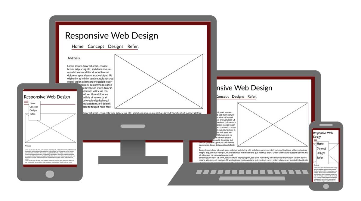
Mock-Ups of Devices
There is a lot to think about when designing for mobile devices. According to N. Babich (2018), US people spend an average of 5 hours a day on their mobile devices, where the majority of that is on an app or website. I have included many principles of mobile design, per the article from N. Babich(2018). These are all very important when considering responsive design.
10 Best Mobile Design Principles
- Minimize Cognitive Load - Don't use too much brain space that is requried for the design.
- Declutter - Every added item can make it look confusing.
- Break-up tasks - Don't create too much complexity for the user. Break up large tasks into smaller ones.
- Use familiar screens - don't re-create the wheel. Users will identify with things/icons they already know.
- Minimize User Input - Typing on a small screen is hard enough as it is. Don't ask the user to type too much.
- Anticipate user needs - Be proactive so the user doesn't have as many steps.
- Use visual weight to convey importance of items.
- Avoid Jargon - Keep the message and action requested straight forward.
- Keep the design consistent.
- The BACK button should work!
Adaptive? Yes or No?
One thing the consider are the types of images can be used. There is either adaptive or responsive images. According to M. Soegaard (2021), responsive images simply check the size of the browser window and arrange the image to that it viewed in the best way. In many times, it is considered automatic. Responsive images are what can also be viewed as fluid.
She uses the thought of a responsive image like water The water is poured into different items (browsers) and it takes the shape of the item it is poured into. This is similar to the image taking the shape of the browser.
Contrary to responsive, adaptive images are based upon a design that has multiple fixed layout sizes. It is normally done with six common screen widths; 320, 480, 760, 960, 1200 and 1600 pixels. As for design, you can image why using responsive images is more beneficial. There would be cost issues on have to create a lot of images for different screen sizes. It is easier and less work to implement, however there may be issues on maintaining optimal site speed with responsive design. According to M. Soegaard, research is showing that site with adaptive design often outperform, with speed tests, a site with responsive design. It' about 2-3 time faster.
So, it all boils down to the end user and what is best for them. Images that adapt to anything they are used with , or having faster performance of the final application/site? There are a lot of variable to consider.
I went with these design choices to keep it as minimalistic as possible when designing my website. My research with the ten principles of design showed that minimalism really was a good approach. I also kept the designs as consistent as possible, having each one look similar to the other. That allows the user to identify the site very quickly. I also tried to maintain colors with good contrast using black, white, and a small accent color of burgundy.