Concept of Mobile Context
Mobile platforms have changed the styling for websites dramatically. According to Mrc. Cup of Joe Blog (2015), one large design flaw that gets missed by many businesses is when they try to have their mobile design mimic the desktop design. What a user on a desktop needs may not be what a user on a mobile platform needs. It's a matter of the experience of the user, regardless of device being used, and a reason why responsive design is important.
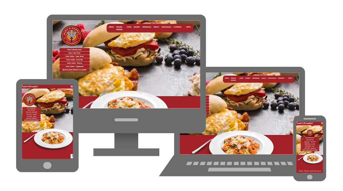
The image below is an example of the various screen sixes that are used in Responsive Web Design with Mary's Market.
Because mobile devices come in various sizes, understanding the viewport size, or browser window size is very important. A viewport can be defined a the size of the rectangle that gets filled by a web page. (2021, Adobe Experience League)
It is noted that the iPad and iPhone are very similar, but when viewed on the devices appropriately, the text and images adjust by shrinking or contracting appropriately. It does not appear that any manual shrinking or expanding is needed.
| Device | Viewport Size | Resolution |
|---|---|---|
| iPhone 12 | 390X844 | 1170X2532 |
| iPhone SE | 214X379 | 640X1136 |
| iPhone X | 375X812 | 1125X2436 |
| iPhone 7 | 375X667 | 750X1334 |
| iPad Air 1&2 | 768X1024 | 1536X2048 |
| iPad Mini | 768X1024 | 768X1024 |
| Samsung Galaxy Note 5 | 480X853 | 1140X2560 |
| LG G5 | 360X640 | 1140X2560 |
| Samsung Galaxy S9 | 360X740 | 1440X2960 |
| Chromebook Pixel | 1280X850 | 2560X1700 |