Analysis of Mary's Market
Responsive web design is, ultimately, how a website automatically adapts to the screen that it is being viewed on based upon the coding it is created with. According to Berry (2021), it can work through CSS using various style properties based upon the device characteristics like screen size. It allows it to be more of a one-site-fits-all by relieving web designers from having to create a different site for every mobile device in existence and maintaining a consistent message for the business owners, marketers or advertisers. (Berry, 2021).
Scrolling can also make or break a website with the user experience. It is sometimes an underrated aspect of UX and can actually cause scrolling fatigue. (Smith, n.d.) A lot of this can be solved through navigation. According to Smith (n.d.) if the navigation of the site is always visible, it makes it easier for the user to access content readily. This is great for vertical scrolling on mobile devices, but what about horizontal scrolling?
According to Ali Shakir (2019), the first thing most people naturally do when then open an app is scroll vertically. But horizontal scrolls can be used on mobile devices when subcategorizing menu items (Ali Shakir, 2019) by using visual indicators like an item “peeking out” from the edge of the screen to indicate the user of a horizontal scroll. But of course, this is all within the content design of the app.
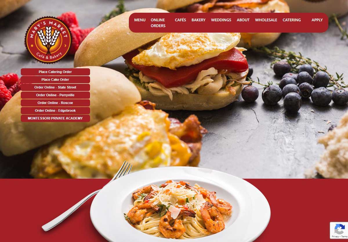
In my analysis of responsive web design, I chose a local company’s website and how it’s responsiveness web design in relation to mobile versatility. The website is for Mary’s Market Café & Bakery at www.marysmarket.com It seems to be locally featured, by ways of location information of their various cafes. This local company’s website seems to be designed for online ordering local food. There seems to be many different options on the mobile web site.
I recognized that is was a responsive web site when I opened up the code by inspecting the developer tools within the site. There was a meta tag with viewport listed as meta name=”viewport” content=”width=device, initial-scale=1.0”. I recognized that this code would allow the code to adjust to the device size specifications, making it more mobile friendly.
In the mobile version of the site, the menu is within the dropdown/hamburger icon at the top. That icon is not on the desktop version. The hamburger icon is only on the very top of the page and a user does have to scroll vertically on the main page. This could lead to scrolling fatigue/disinterest. The rest of the page has images and text on the homepage is truncated from the desktop version vertically. It has the same information, but again, a lot of scrolling. The images and text are linked to other pages within the site that are in the menu. I did find, though, that some are highlighted as links but do not go anywhere. This was the case with the locations listed at the start of the mobile web site. Those links were available at the bottom of the mobile page.